Masking up
There are fewer COVID-19 cases reported in states with higher rates of mask use. According to the data science behind the analysis and the data visualization this is a powerful argument for wearing a mask.
I came across this data and wanted the opportunity to practice my Excel visualization skills as well as my Python skills in applying a linear regression model to a data set. Linear regression is one of the family of algorithms used in supervised machine learning (ML) tasks. Supervised ML tasks are generally divided into classification and regression - with linear regression in the latter category. I am trying to predict a continuous number rather than a class or category. In this example, I am trying to predict the prevalence of COVID-19 cases by knowing how often people wear masks.
Regression tasks split into two main groups:
-
One feature is used to predict the target
-
More than one feature is used to predict the target
Since this example is using one feature (how often people wear masks) to predict the target (prevalence of COVID-19 in the community) the task falls into simple linear regression.
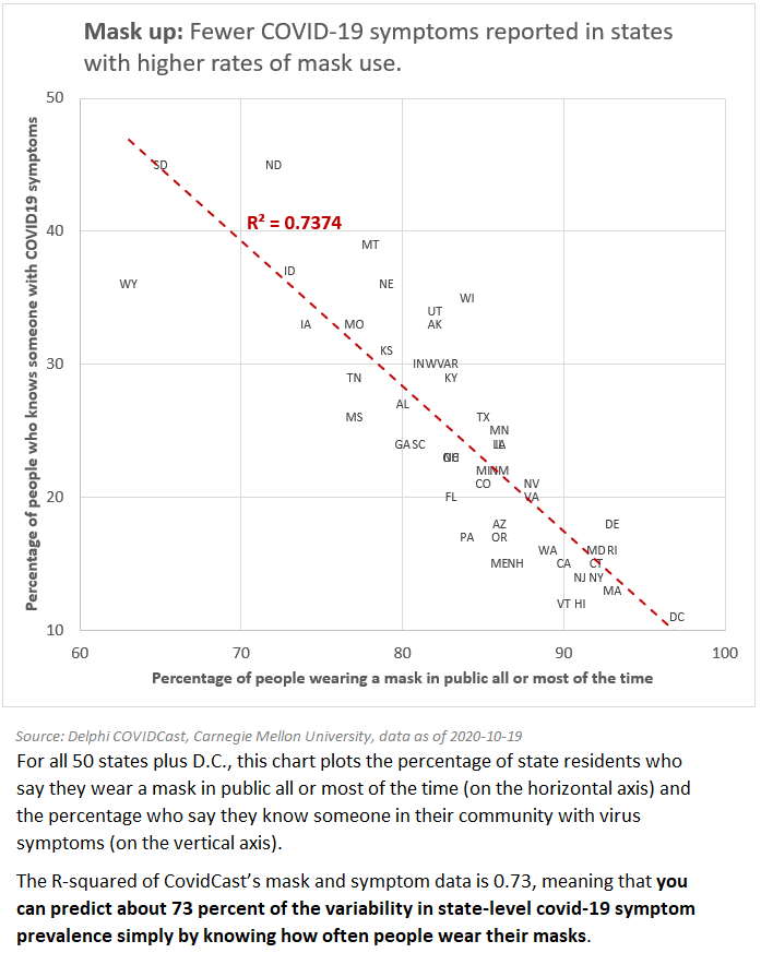
For all 50 states plus the District of Columbia (D.C.), the chart below plots the percentage of state residents who say they wear a mask in public all or most of the time (on the horizontal axis) and the percentage who say they know someone in their community with virus symptoms (on the vertical axis).
The r-squared of the CovidCast mask and symptom data is 0.73, meaning that you can predict about 73 percent of the variability in state-level COVID-19 symptom prevalence by knowing how often people wear their masks.
Yes, correlation is not causation. Certainly there are differences between the states beyond the use of masks. People in rural places may spend less time close to others so may feel less of a need to wear a mask. Many states with high mask usage had major outbreaks earlier in the pandemic - so mask wearing may be more common in these states. Never less, this data is interesting to data scientists and could be useful to epidemiological researchers interested in studying the public reaction to the pandemic and its spread.
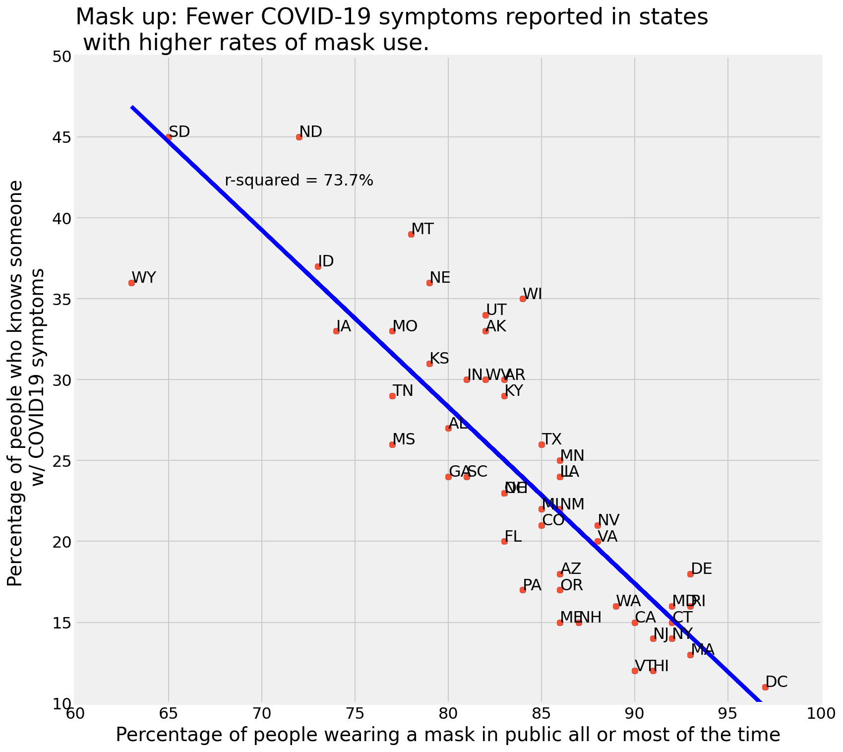
The above was created quickly in Excel. I also wanted to practice my Python and see if I could recreate the analysis and data viz in code.
Using pandas, I read the CSV data into a dataframe called mask_up and assigned the wearing a mask data field to the x-values and the COVID-19 symptoms data field to the y-values and ran an ordinary-least-squares (OLS) regression. Once that was done it was easy to calculate the r-squared value:
r2 = r2_score(y, linefitline(x))
The plot took a bit of experimentation to get the settings and formats the way that I wanted. I’m still not happy with the linestyle but it will do for now. See below.
Wear your masks!
Here’s the code used to produce the graph above:
# plot line
plt.plot(x, line1, color = 'b', linestyle='-')

# plot scatter
for i, txt in enumerate(mask_up['state']):
    plt.annotate(txt, (x[i], y[i]), xytext=(0, 0), textcoords='offset points')
    plt.scatter(x, y)

# labels
plt.xlabel('Percentage of people wearing a mask in public all or most of the time')
plt.ylabel('Percentage of people who knows someone \n w/ COVID19 symptoms')
plt.text(68, 42, 'r-squared = {:.1%}'.format(r2))

plt.title('Mask up: Fewer COVID-19 symptoms reported in states \n with higher rates of mask use.', loc='left')

# grid
xmin = 60
xmax = 100
plt.xlim(xmin, xmax)

ymin = 10
ymax = 50
plt.ylim(ymin, ymax)

plt.show();