I hate pie
…graphs, not the food variety.
Apple pie, pumpkin pie, blueberry pie, lemon meringue pie…I like them all. Pie graphs…I hate pie graphs.
If you know me, or have heard me give a presentation on the visual display of quantitative information, then you know of my dislike for pie graphs.
Over the past few years there have been a lot of discussions about pie charts, mostly advising against their use. So I am not alone.
-
Ask E.T. - Pie Charts (forum), hosted by Edward Tufte
-
Save the Pies for Dessert(pdf), by Stephen Few, Perceptual Edge
-
Piecharts are for middle management(scroll down one screen), by Coda Hale
-
Warning against using piecharts, by Bernhard Reiter
-
Learned Bad Ideas, by Jamuraa, Base Zero
-
Pie Charts Must Die. Mmmmm. Pie.by Eric G. Myers
-
The Problem with Pie Charts, by Zach Gemignani, Juice Analytics
-
Wikipedia – warning against pie chart usage
-
Pie Charts – Writing for Change – Effective Writing
Jon Peltier, another excellent source for graphing tips and tricks, recently wrote a lengthy article on pie charts and a particular example where the data could be presented in a better fashion. See link:
http://peltiertech.com/WordPress/which-blogging-platform-do-you-use/
Pie charts are ubiquitous, and many people have the false impression that pie charts are an effective means of conveying numerical information. Research shows that they are not. According to William Cleveland, the effectiveness of different human visualization skills are ranked as follows:
-
Position along a common scale
-
Position along identical unaligned scales
-
Length
-
Angle or slope
-
Area
-
Volumn
-
Color
A pie chart relies upon angle (4th in the list) or area (5th). A pie chart also needs different colors for each point, so there may be some unintended weighting of values by color; some colors may be bolder than others, or there may be connotations related to certain colors (e.g., green = good, red = bad).
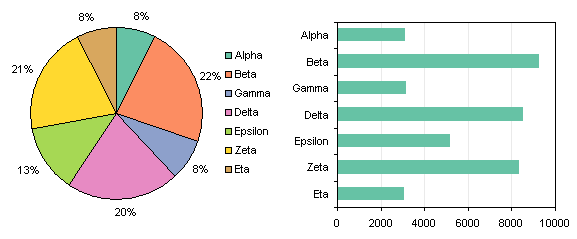
The bar graph in the picture below can certainly be improved dramatically but it is still a significant upgrade from the chart-junk that is the pie graph in the same picture. There’s another good example in the chart recreations file I provided in a previous post. In that file, the “iPod Carries Big Stick” graphic at the bottom of the iPod worksheet is a more effective display of the information than the original “iPod Takes Big Bite”.

What? You are not convinced and are still reading. OK, if you insist, here’s my advice for pie charts.
Guidelines for Pie Charts
-
ALWAYS avoid pie charts. Especially avoid pie charts for a technically and numerically literate audience. Usually a bar chart is an effective substitute.
-
See rule 1. (I’m not kidding).
If you disregard the first two rules, you’ll probably disregard the rest, but for what it’s worth, here it is: -
Use data labels on the segments rather than a legend.
-
Limit pie charts to no more than about 3 segments.
-
Sort segments in descending (or ascending) order by numerical value.
-
Use 2D pie charts ONLY. NEVER use 3D in any graph.
-
Do NOT use shadows, fill gradients, glows, or other distracting effects.
-
Do NOT use multiple pie charts for multiple sets of data.