Unemployment - Chart Recreations
TIL: Shaded area on a line graph in Matplotlib using pyplot.
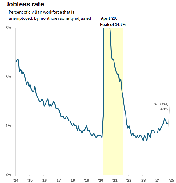
Dr. Drang had two posts on All This about the jobless rate (unemployment) and his use of Matplotlib and Python for plotting. I decided to experiment. I always love a good chart recreation exercise. Ticks tricks provides the details while Rescaling a graph was the original post.
1. Obtain the same data
Use the BLS link:
https://www.bls.gov/charts/employment-situation/civilian-unemployment-rate.htm
Click on the Show Table link on that page.
Copy and Paste Special Values that data into an Excel or Numbers file and save it as a CSV.
Drang does EDL on the file first:
-
Extract January 2014 to October 2024
-
Delete everything except the first two columns.
-
Relabel them
DateandRate. -
Save as CSV named
unemployment.csv -
Deal with June, July, and September which need to be converted to their three letter abbreviations. Drang uses regular expressions and BBEdit. Sublime works too. His notes:
The regular expression in the Find section is
^(\w\w\w)\wIf you select that line you’ll see there’s a space at the end of it, which is important. The Replace regex is
\1and there’s a space character at the end of it, too.
It doesn’t look like I need to deal with this as I did some EDA in Excel and it looks like I have the final CSV formatted with only three character months. The space at the end of the regex and the use of the group are good tools to remember.
2. Plot the data
Dr. Drang’s code with line numbers:
 1  #!/usr/bin/env python3
 2
 3  import pandas as pd
 4  import matplotlib.pyplot as plt
 5  from datetime import datetime
 6  from matplotlib.ticker import MultipleLocator
 7  from matplotlib.dates import DateFormatter, YearLocator
 8
 9  # Import data
10  df = pd.read_csv('unemployment.csv')
11  x = pd.to_datetime(df.Date, format="%b %Y")
12  y = df.Rate
13
14  # Create the plot with a given size in inches
15  fig, ax = plt.subplots(figsize=(5,5))
16
17  # Add a line
18  ax.plot(x, y, '-', color='black', lw=2)
19
20  # Set the limits
21  plt.xlim(xmin=datetime(2014,1,1), xmax=datetime(2025,1,1))
22  plt.ylim(ymin=2, ymax=8)
23
24  # Set the major and minor ticks and add a grid
25  ax.xaxis.set_major_locator(YearLocator(1))
26  ax.xaxis.set_major_formatter(DateFormatter('        ’%y'))
27  plt.setp(ax.get_xticklabels()[-1], visible=False)
28  ax.yaxis.set_major_locator(MultipleLocator(2))
29  ax.yaxis.set_major_formatter('{x:.0f}%')
30  ax.yaxis.set_minor_locator(MultipleLocator(1))
31  ax.grid(linewidth=.5, axis='y', which='both', color='#dddddd', linestyle='-')
32
33  # Title and axis labels
34  plt.title('Civilian Unemployment')
35
36  # Annotations
37  plt.text(datetime(2020, 4, 1), 2.45, "Peak of 14.8% in April 2020", ha='center')
38  plt.arrow(datetime(2020, 4, 1), 2.75, 0, .45, head_width=50, head_length=.25, lw=.75, fc='black', zorder=100)
39
40  # Make the border and tick marks 0.5 points wide
41  [ i.set_linewidth(0.5) for i in ax.spines.values() ]
42  ax.tick_params(which='both', width=.5)
43
44  # Save as PNG
45  plt.savefig('20241103-Improved unemployment graph.png', format='png', dpi=200)
The Ticks tricks post covers the specifics about the code well. Review that post for details.
My final version is shown below. I had assistance from Duck Duck Go and CoPilot on the title, subtitle, labels, Pandemic shading area, and a few other formatting options.
# my final version, thanks to both DuckDuckGo and CoPilot for assistance with labels, the Pandemic shading, and formatting of the Title and Sub-title
import pandas as pd
import matplotlib.pyplot as plt
from datetime import datetime
from matplotlib.ticker import MultipleLocator
from matplotlib.dates import DateFormatter, YearLocator

# Import data
df = pd.read_csv('unemployment.csv')
x = pd.to_datetime(df.Date, format="%b-%Y")
y = df.Rate

# Create the plot with a given size in inches
fig, ax = plt.subplots(figsize=(9, 9))

# Add a line
ax.plot(x, y, '-', color='black', lw=2)

# Set the limits
plt.xlim(xmin=datetime(2014,1,1), xmax=datetime(2025,1,1))
plt.ylim(ymin=2, ymax=8)

# Set the major and minor ticks and add a grid
ax.xaxis.set_major_locator(YearLocator(1))
ax.xaxis.set_major_formatter(DateFormatter('        ’%y'))
plt.setp(ax.get_xticklabels()[-1], visible=False)
ax.yaxis.set_major_locator(MultipleLocator(2))
ax.yaxis.set_major_formatter('{x:.0f}%')
ax.yaxis.set_minor_locator(MultipleLocator(1))
ax.grid(linewidth=.5, axis='y', which='both', color='#dddddd', linestyle='-')

# Title and axis labels
plt.suptitle('Jobless rate', x=0.1, ha='left', fontsize=18, fontweight='bold')
plt.title('Percent of civilian workforce that is unemployed, by month, \nseasonally adjusted',
           x=0.0,
           ha='left',
           fontstyle='italic',
           fontsize=14)

# Annotations
plt.text(datetime(2020, 4, 1), 2.6, "Peak of 14.8% in April 2020", ha='center')
plt.arrow(datetime(2020, 4, 1), 2.75, 0, .45, head_width=50, head_length=.25, lw=.75, fc='black', zorder=100)

plt.text(datetime(2024, 10, 1), 3.0, "October '24:\n 4.1%", ha='right')
plt.arrow(datetime(2024, 10, 1), 3.3, 0, .45, head_width=50, head_length=.25, lw=.75, fc='black', zorder=100)

# Make the border and tick marks 0.5 points wide
[ i.set_linewidth(0.5) for i in ax.spines.values() ]
ax.tick_params(which='both', width=.5)

# SHADED AREA for pandemic (e.g., March 2020 to September 2021)
ax.axvspan('2020-03-01', '2021-08-31', color='yellow', alpha=0.5, label='Pandemic')

# Add label within the shaded area
# pd.Timestamp specifies X coordinate and 14 specifies the Y
ax.text(pd.Timestamp('2020-03-15'), 4.0, 'Pandemic', color='black', fontsize=12, ha='left')

#plt.show()

# Save as PNG
plt.savefig('2024-11-06-Jobless_Rate.png', format='png', dpi=200)
Looks pretty good if I do say so myself. Certainly things could be improved (peak, Pandemic, and October ‘24 labels) or debated (span of the shading on the “Pandemic” era) but overall I am pleased. TIL how to add a shaded area to a line plot in Matplotlib.

For good measure, I tested myself and did it in Excel as well. Had to make a few different choices on labels and I got tired of trying to get the call-out shape on Oct ‘24 just right. Again, overall I’m pleased.
