The Impact of Vaccines
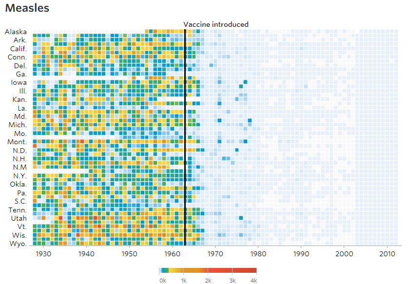
I’m always on the lookout for interesting and impactful visualizations and the WSJ Graphics usually does not disappoint. Recently they put together a series of visualizations demonstrating the impact of vaccinations on various diseases.
The WSJ paywall is odd so if that link does not work just Google the article’s full title and follow the link from the search results to see the original: “Battling Infectious Diseases in the 20th Century: The Impact of Vaccines”. The heat maps show the number of cases per 10,000 people measured over 70-some years across all 50 states and the District of Columbia. That is a large amount of data summarized in a compelling fashion.