Pie Charts Suck! NBC Olympics coverage too.
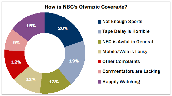
I recently came across the article “How We Hate NBC’s Olympics Coverage: A Statistical Breakdown” and meant to write about the use of graphs in the article. The author (or editors) decided to lead with a donut chart - possibly the only graph I despise more than a pie graph and I immediately recognized that it was not even an original chart, they had simply used the default settings in Excel 2007 to produce the graph.
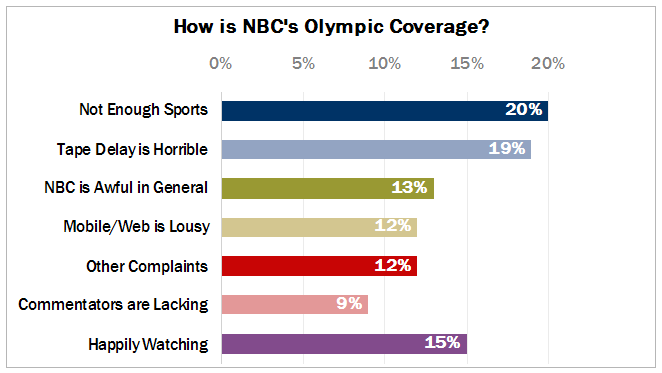
I did the same to produce the image below. Mind that the image below is already an improvement as I’ve taken the liberty of sorting the data points so that the negative and positive sentiments group together in descending order.

So what’s wrong with this graph anyway?
It has been shown many times that people are not very good at judging angles or areas, which makes pies ineffective for all but the simplest parts-of-a-whole displays (read - two pieces of pie maximum). Donuts take this one step further, cutting out the center, forcing the reader to rely on area comparisons alone, without any help from the angles where all the wedges should meet.
Coincidentally, the donut resembles the big fat zero most viewers would give NBC as a grade.
But other than sorting the data appropriately, how else can this be improved? The munchkin piece could be added back but we’d simply be left with a pie and not much better off. What if we transform it into a bar graph (candy bars if you’d like to stay with the food as graph meme)?

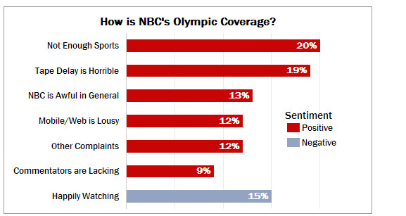
That is better, but why? The labels are adjacent to the data and not off in some distant legend and the lengths of the bars are easily compared. The actual values are encoded onto the graph (some might say this is over-kill). The multi-colored bars might cause confusion though, so there’s another potential improvement. We don’t want the reader hunting around for another legend or color key so I would normally suggest using one shade for all the bars except in this case there is such a clearly defined category comparison that I think two shades are required. Negative versus Positive sentiment. In the graph below I have also done away with the X-axis labels because I felt they were redundant if the data labels were being displayed at the end of the bars. Either one or the other is required. What is preferred? Axis labels, data labels, or both?

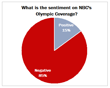
And so my colleagues do not think I never use pie graphs, I would say this is actually a fine time for a pie graph. Perhaps the author or editors should have chosen the following graph as the only visual for the article. The classic Pac-Man graphic - probably the only time I approve of pie graphs.

My bottom line, the same as ever - think about the story you are trying to tell and then design a graphic to go with that story. Also, if you simply throw the data onto an Excel worksheet and use the default settings of any chart type, there’s going to be significant room for improvement in your final product.